RickyHilmi.com

Launching Zite: How Fillout Attracted Early Access Users

How Fillout introduced Zite using early access, simple messaging, and real user feedback. Learn key product launch and validation lessons from this case study.

Screenshot of Zite’s landing page with the headline “Build with Zite”, demo video thumbnail, and a checklist showing Email, LinkedIn Post, and Landing Page.
This case study is written entirely in English for accessibility and reference purposes.


First Impression: Not Just Another Email

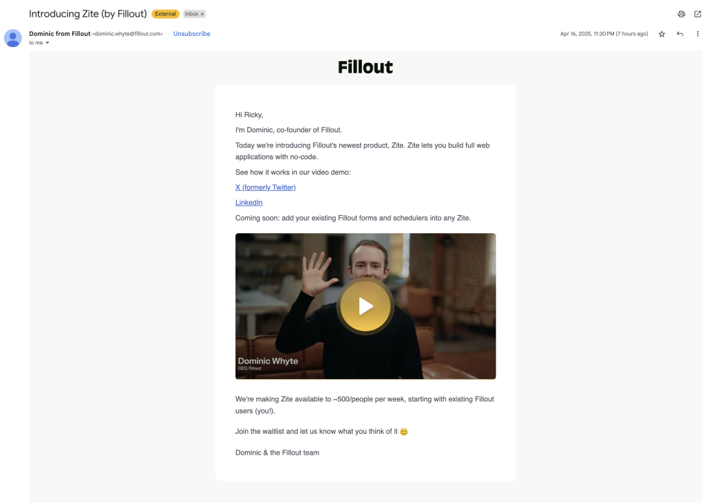
I recently got an email from Fillout, the form builder tool we use for our projects. This time, they introduced something new called Zite, a no-code application builder.

At first, I thought it was just another product announcement. But the way they presented it made me stop and explore.
 

What Was Inside the Email?

The email was short but packed with useful elements:

  • A product demo video (1 minute 50 seconds)
  • Links to LinkedIn and X (formerly Twitter) posts
  • A note mentioning the demo was limited to around 500 users per week

The structure is clean and focused. It made me curious enough to explore further.

Screenshot of an email from FillOut introducing Zite, featuring Dominic Whyte with a demo video and links to X and LinkedIn.
The initial email introducing Zite, sent by FillOut’s co-founder, including a short video and social links.


Exploring the LinkedIn Post

I clicked the LinkedIn link to learn more. The post had a clearer explanation of Zite and what it offers.

Key Elements in the LinkedIn Post:

  • A short description of what Zite is
  • Three main benefits for the user
  • A direct call-to-action to join the waitlist
  • The same demo video from the email


LinkedIn post by Dominic Whyte introducing Zite, listing three challenges of no-code tools, and including a video and waitlist link.
Zite’s official announcement on LinkedIn highlights market problems, solutions, and a direct call to action.

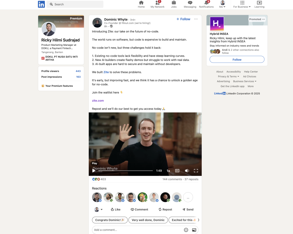
It was informative without being too long. Everything felt connected and easy to follow.
 

The Landing Page Experience

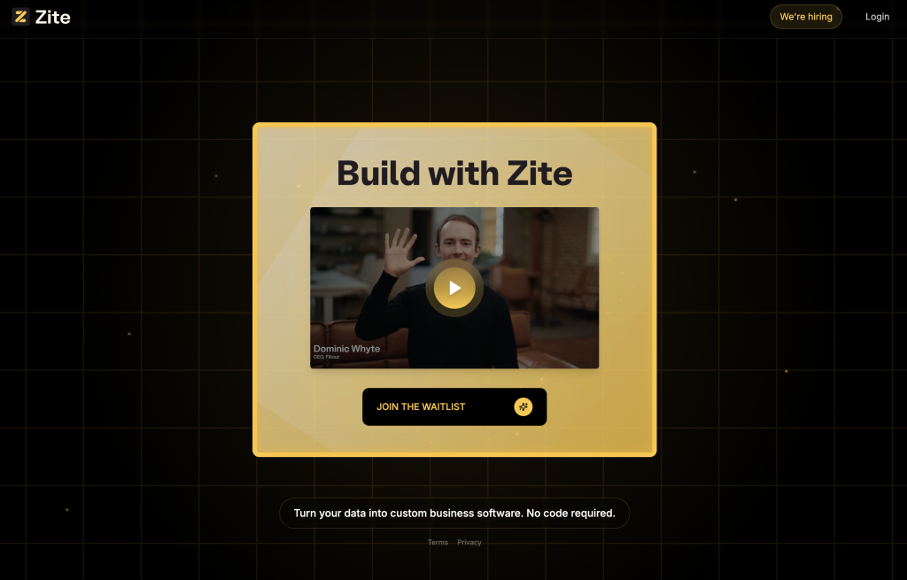
After clicking the CTA, I landed on a minimalist landing page. It had a headline, a tagline, a video, and a bold button.

The headline said, “Build with Zite”. The tagline read, “Turn your data into custom business software. No code required.”

Zite’s landing page with the headline "Build with Zite", demo video, and a join waitlist button over a dark grid background.
The Zite landing page features a simple message and bold visuals that reinforce product clarity.


When I clicked the join button, a short form popped up. It asked for my email, what I wanted to build, and what apps I would like to connect.

Zite waitlist form asking for email, intended use case, and connected apps, with a “Join the waitlist” button.
Zite’s sign-up form captures user intent through three simple fields before granting access.

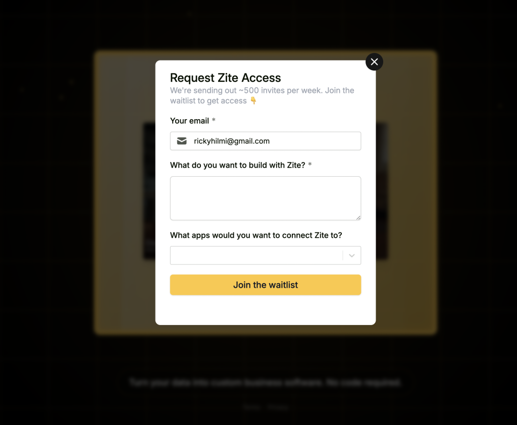
The form was simple, clear, and focused only on what really matters. It felt intentional and gave the impression that the team truly wants to learn from real user needs.
 

Lessons from This Product Journey

This experience showed me how powerful a well-designed early access launch can be. By limiting demo access and keeping the messaging simple, Zite managed to spark curiosity and attract the right audience.

Book cover of The Lean Startup by Eric Ries with a blue background and a white circular brushstroke.
The Lean Startup by Eric Ries is a foundational book on building and validating products through continuous learning and iteration.

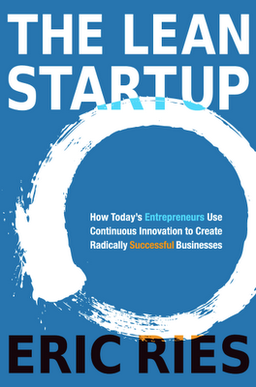
Their approach reflects key principles from The Lean Startup by Eric Ries, which emphasizes releasing early and learning fast. Instead of perfecting the product behind the scenes, they invited users into the process.

Zite also used a lightweight form to ask what users want to build and which tools they plan to connect. This tactic is aligned with the framework in Testing Business Ideas by David J. Bland and Alex Osterwalder, where even simple questions can uncover valuable insights.

Lastly, it reminded me of the method in Sprint by Jake Knapp, where teams validate ideas through focused prototyping and real user feedback. Zite is a great case of learning before scaling.

Key Lessons to Take Away:

  • Create exclusivity to build curiosity
  • Keep your messaging consistent across all touchpoints
  • Ask users the right questions early to guide product direction
  • Use feedback from early adopters to improve quickly
  • Focus on learning, not perfection, in the first version


Final Thoughts

Zite shows how a simple, well-structured launch can make a big impact. It proves that clarity often works better than complexity.

Sometimes, keeping things simple is the smartest move. And in this case, it definitely worked.